"Fan menus" for user-interfaces
I just had a look on this page on pie-menus as an alternative to the usual 'vertical list' menus in most user-interfaces. I also had a quick skim of the comments, where there was some discussion about the pros and cons of both types of menus. E.g. while pie menus can be faster, the radial layout makes it harder to scan the available options.
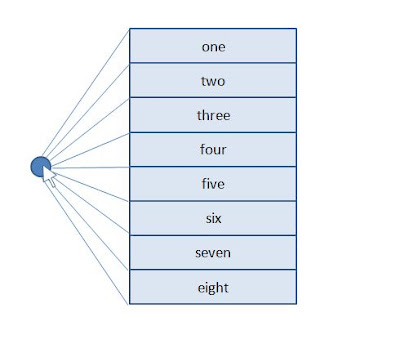
And it made me wonder if there was a middle ground between the two. I have no idea whether this idea has been suggested before, but here goes... you might call these "Fan menus" (I'm thinking here of the asian foldable paper fans).
In this first picture, the user has clicked the mouse and the fan menu appears. Note that the main body of the menu itself appears to the side of where the mouse is clicked. 
In this second image, the user has moved the mouse into the fanned out element for the third menu item. The selection process is similar to in a pie menu.
In this picture, the user has moved the mouse down to select the fourth item. 
Naturally, there's potential issues with such a design, but I thought it'd be interesting to think about.
Very compelling idea, you could alter the fan shape/widths so they are a bit more spread out and slide the rectangular menu to the right and grow it as the user move to the right so the targets can be as large as you want but keep the readability of the rectangle.
ReplyDelete